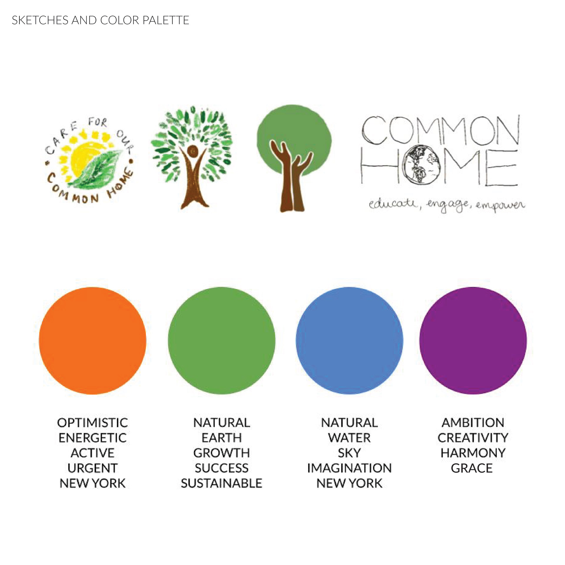
The Common Home logo is a vibrant and meaningful representation of Fordham University's commitment to sustainability and environmental stewardship. The design process progressed through multiple stages—from initial sketches to refined geometric compositions—ensuring that each iteration brought the concept closer to its final form.
Logo Design
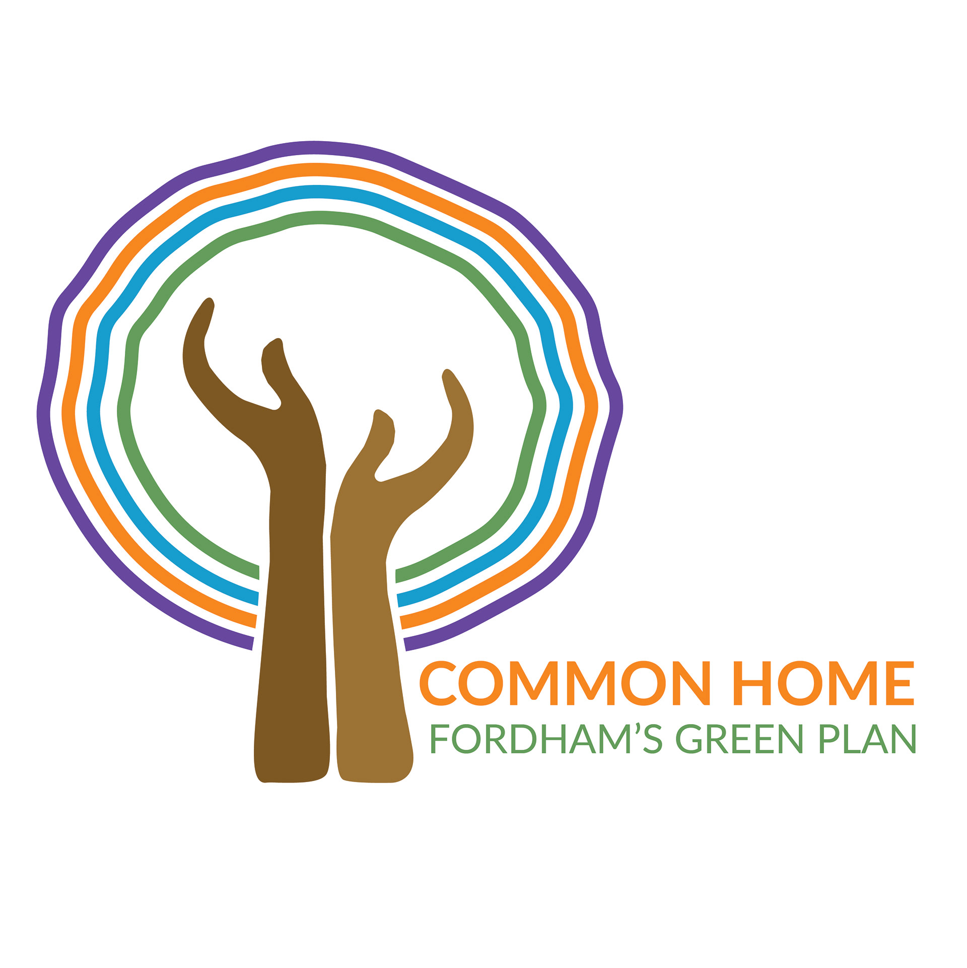
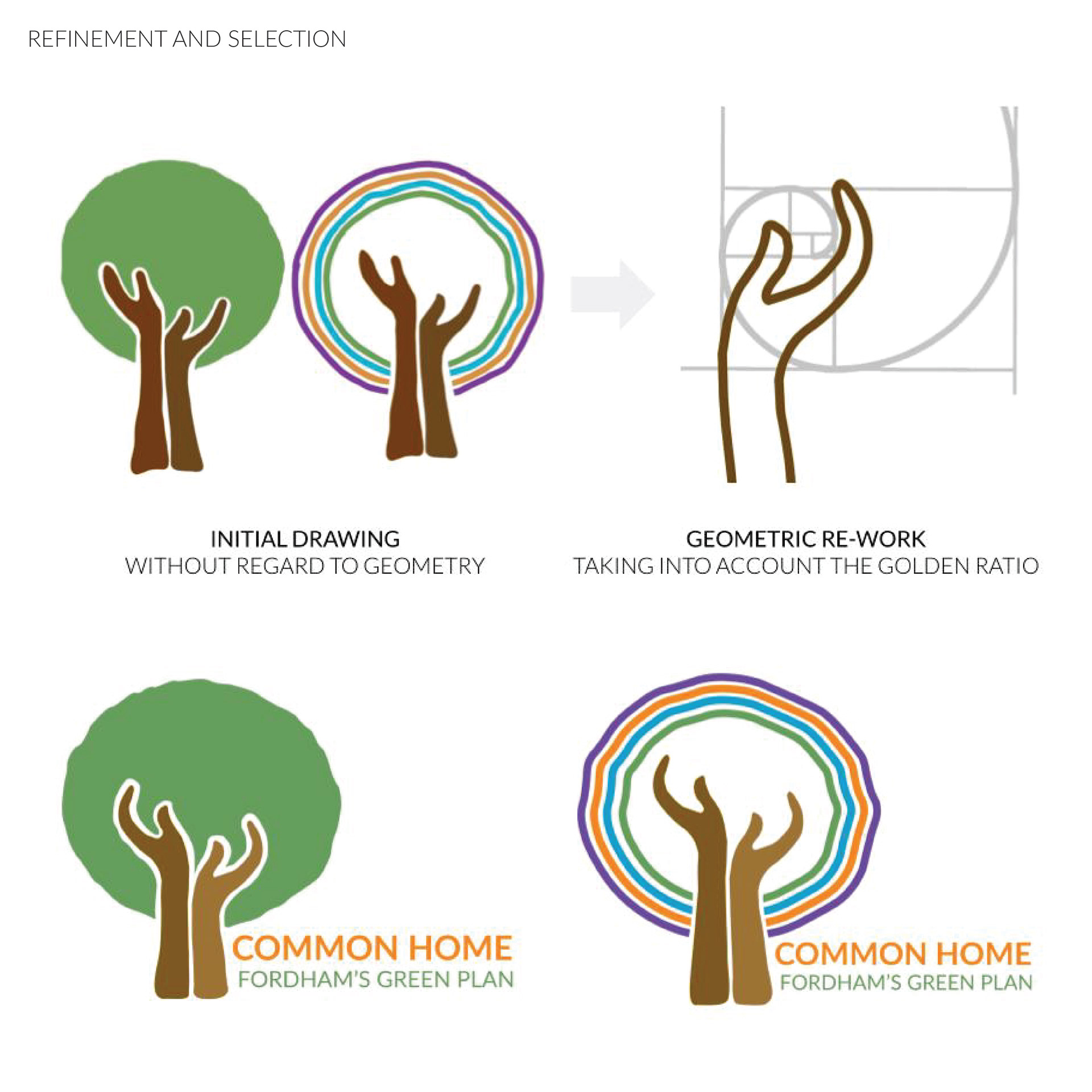
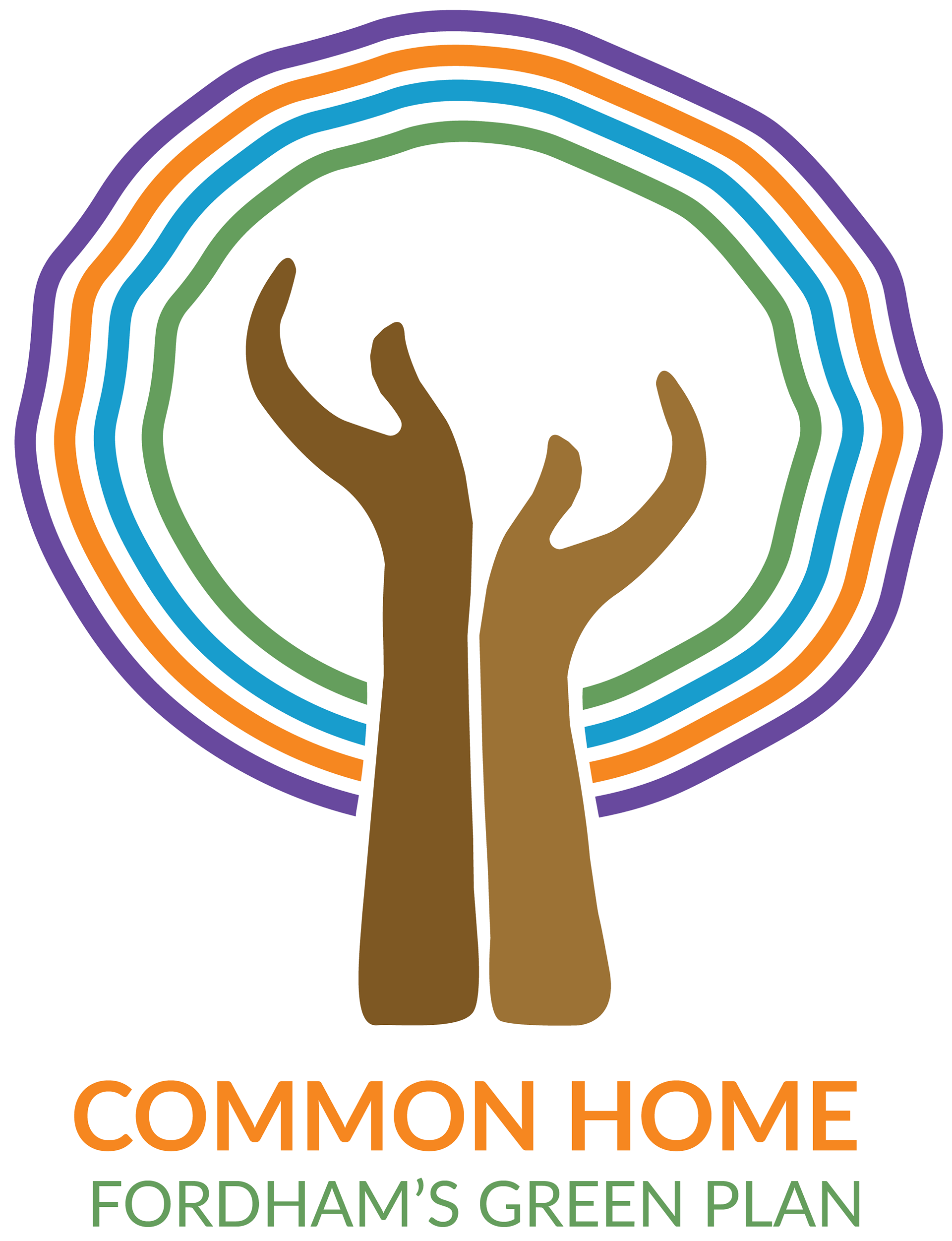
The logo features two hands reaching upward, symbolizing growth, support, and community. These hands form the trunk of a tree, reinforcing the idea of nurturing our common home—Earth. Surrounding them are colorful rings that evoke unity and diversity, reflecting the inclusive nature of Fordham’s Green Plan.
Color Palette & Meaning
Each color was intentionally chosen to reinforce the logo’s message:
🟠 Orange – Optimism, energy, and urgency
🟢 Green – Nature, growth, and sustainability
🔵 Blue – Water, sky, and imagination
🟣 Purple – Ambition, creativity, and harmony
🟠 Orange – Optimism, energy, and urgency
🟢 Green – Nature, growth, and sustainability
🔵 Blue – Water, sky, and imagination
🟣 Purple – Ambition, creativity, and harmony
Design Refinement
To ensure balance and aesthetic appeal, the logo was refined using geometric principles, including the Golden Ratio. This intentional approach underscores the careful thought behind creating a design that is both visually striking and deeply symbolic.
Project Statement
Laudato Si’ is a crucial initiative advocating for a more sustainable and equitable future at Fordham University. Common Home was created to reflect this vision, promoting community, collaboration, and empathy. Designed to be adaptable across contexts—from Fordham’s campus to the broader city community—the logo serves as a symbol of shared responsibility and unity in caring for our environment.
I developed the name "Common Home" to encapsulate the spirit of collective action in sustainability. Together, the name, logo, and branding demonstrate how design can communicate powerful messages and inspire meaningful change.