Aquaphor Rebrand – Modernizing a Legacy
As Aquaphor reached its 100th anniversary, it was time for a refresh that honored its heritage of simplicity and reliability while introducing a modern, approachable look. This rebrand maintains the brand’s professionalism and trustworthiness while infusing it with warmth, personality, and a contemporary aesthetic.
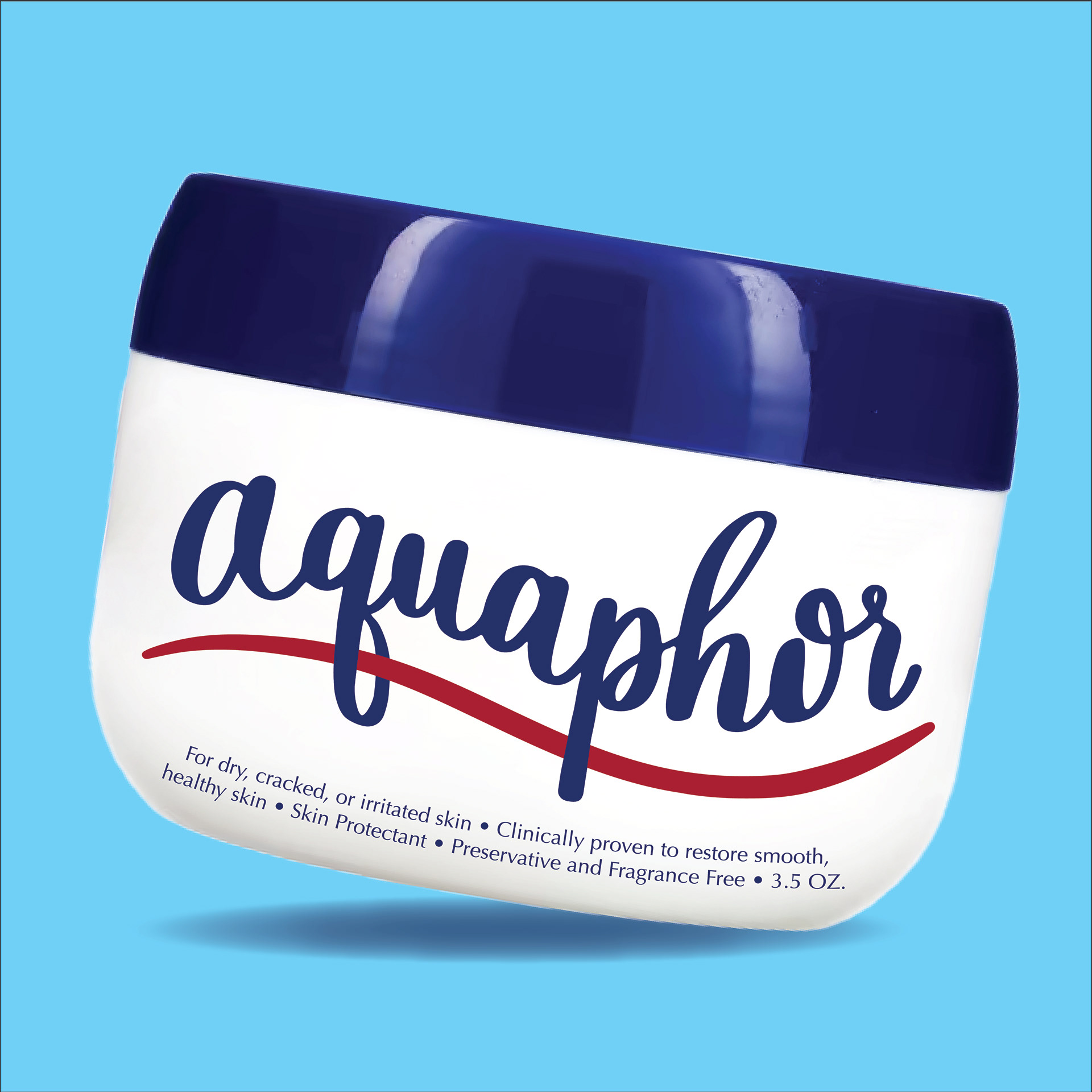
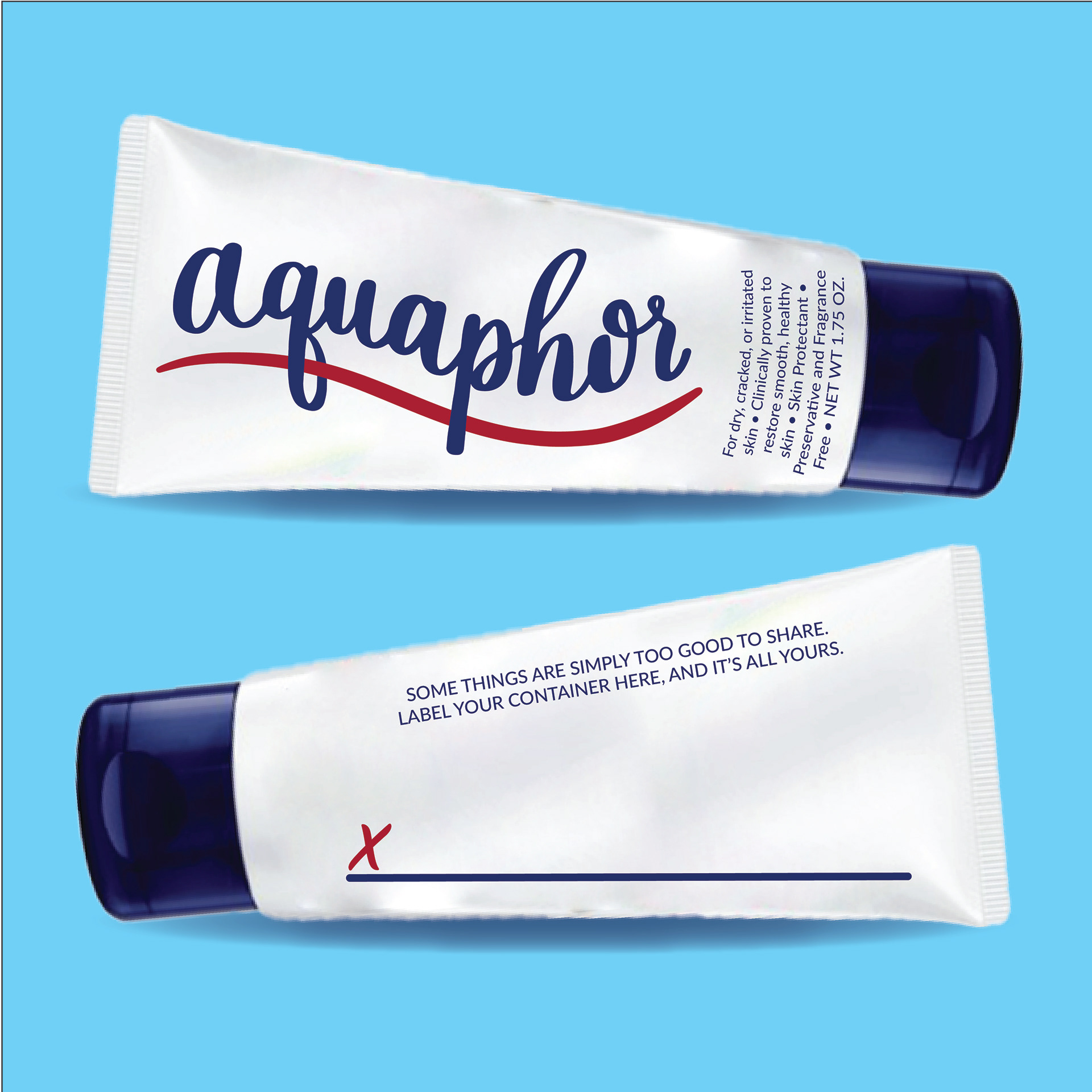
Logo Redesign
The updated script logo reflects smoothness, softness, and longevity—qualities that define Aquaphor’s product. The handwritten style adds a human touch, reinforcing the brand’s everyday presence in people’s skincare routines. A subtle underline nods to protection and repair, key pillars of Aquaphor’s identity.
Packaging & Campaign
The redesigned packaging system enhances brand recognition with a clean, modern layout while keeping the signature blue and white color scheme. A bold, conversational ad campaign ("Too Good to Share") highlights Aquaphor’s effectiveness and personal connection to users, making it more relatable and engaging. A dynamic pattern system inspired by hydration and skin protection ties the new branding together, creating a cohesive visual identity across platforms. This rebrand balances heritage and innovation, ensuring Aquaphor remains a trusted household staple while appealing to a new generation of consumers.